Tuesday, September 2, 2014

Game Review: Twisted Racing

Today I'm going to be reviewing Twisted Racing! Fasten your seatbelts!

Twisted Racing is a game made by Taymaster, developer of Twisted Plastic 2. You start out with a cart, and then earn more money to buy more carts for better stats. Players can buy money from the store or get money from winning races.

If you go to Taymaster's twitter, he occasionally releases codes which players can redeem and unlock carts.

My Experience:

Heavy ammunition!
While playing Twisted Racing 2, I had a really fun time. The carts were well built and scripted. The maps feel like good racing maps, however some of the maps are not good for competitive racing, as they don't have much room for every racer.

While the carts drive smoothly, when you are rammed by someone else, it is hard to control yourself and you often run into walls. While this might happen in Mario Kart, the game that it is most like, when you start the match, everyone is bumping into each other. I think this should be fixed.

Revenge!
Finally, this game is not something that you easily get bored of. The developer often releases new maps and new carts. There's usually something new to buy or a new map to learn, and I think every time you play, there's a different experience. New competition to try and beat, different outcomes. And the level system always keeps you trying harder to level up.

RESULTS:

Graphics: 10/10
Model Design: 10/10
User Interface: 10/10
Gameplay: 8/10

Overall Score: 38/40
Rating: Nearly Perfect!

Overall, Twisted Racing is an amazing game developed by Taymaster. This game is incredible, with the only problem being the cart bumping. If that was changed, I would give this a 40/40.

Thanks for reading!
Xeronae

Wednesday, August 20, 2014

Game Review: Zed Defense Tycoon

Zed Defense Tycoon is a great game made by RoyStanford.
Hello, and welcome to the Bloxxer! Today I'm going to be reviewing a game which I personally consider a pretty great game. Now, without further ado, my review of Zed Defense Tycoon!

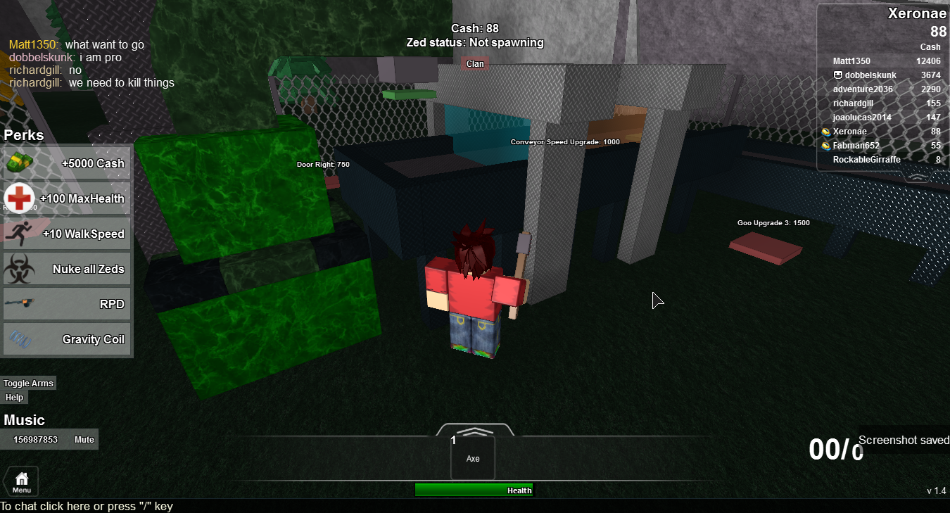
In Zed Defense Tycoon, players start out with an axe and a goo machine. The machine generates money, and you can upgrade it and buy more machines. Players are also able to fight zombies in order to earn money, with special zombies, such as a tank or hunter, earning them more money than regular zombies.

The game has a Perks shop where players can buy various things such as cash, health, speed, and gear. You can also nuke every Zed on the map, which can get you a lot of
I got you right where I need you...
money. However, the gear is one-life only. If you don't stay alive for long, I don't recommend buying any gear.


My Experience:

When I played Zed Defense Tycoon, I had lots of fun. I died a few times fighting the zombies, but that just pushed me to try harder! I loved going into the horde and fighting the zombies as they spawned. It was a total blast!
Charge!!!


The game was well-made and I liked how it was built. I thought that the UI was well-made and user-friendly. The Perks menu wasn't in my way and there weren't an overload of menus like some games have.

Now we're getting somewhere!
Additionally, I liked the map. It wasn't just a baseplate, yet it didn't have excess detail that made the game run slowly and take away some of the fun. The map fit the theme of the game, and the scenery was detailed.

This game may keep you here for a while, but it doesn't keep me coming back. I play it occasionally, but it's not like other games where you might play it everyday. The game gets repetitive if you play it too much, because there's nothing extra out there for you to do.

RESULTS:

Graphics: 9/10
Model Design: 10/10
User Interface: 9/10
Gameplay: 7/10

Overall Score: 35/40
Rating: Exceptional!

Zed Defense Tycoon is a great game developed by RoyStanford. It is very fun yet doesn't keep my attention. If there were extra content to unlock, I would be playing this a lot more.

That's all for now! Thanks for reading,
Xeronae

Tuesday, August 19, 2014

Game Review: The Mad Murderer

The mad murderer is a well-known game. It has been on the front page for quite a while, and people have even been finding the outfits of the characters and dressing up as them. And while there has been a discussion about it, I thought I would review it!

The Mad Murderer is a game developed by Mad Studio, a group of developers working to make hit games. You're able to buy Murderer Abilities, Accessories, and Knife Textures in
Oh man, here he comes!
the shop with credits. Players can earn credits by winning rounds, getting their daily log in bonus, buying them with credits, or from a credit rain in the VIP room or if another player purchases one.


Each round, a player is either innocent, in which they have to avoid the murderer, sheriff, where they have to kill the murderer and avoid being killed, or murderer, where they have to kill everyone and avoid being killed by the sheriff.

My Experience:

When I played The Mad Murderer, I had a great time. I had already bought the VIP Room access and the Epic Radio gamepass, so I had a bonus. I thought that the menus were made nicely and the game ran smoothly. I hadn't
Murderer Madness!
experienced very many bugs in the game - the rounds always went smoothly, there was always a murderer and sheriff.


However, there were a few bugs, and exploiting is a major problem. One time, the gun was in the lobby, so no one could get it. People were speedhacking, no-clipping, etc. There was a fix for some exploiting, such as godmode, but still, people continue to exploit. I think this ruined the fun.

My favorite part of the game was Murderer Madness. Murderer Madness is a minigame in which everyone is a murderer. This really makes the game more intense since everyone is fighting to survive! There's no innocents, no sheriff, no hiding. Everyone is after you. It's pretty great.

RESULTS:

Graphics: 10/10
Gameplay: 9/10
Map Design: 7/10
User Interface: 10/10

Overall Score: 36/40
Rating: Exceptional!

In conclusion, The Mad Murderer is a quality game with lots of new content coming to keep players coming back. The game is well made and I will definitely be playing this again. If the exploits were patched, this game will be amazing.

Keep calm and blox on,
Xeronae

Saturday, August 16, 2014

The Game Promotion


Seemingly every week, a new, well-made game surfaces the front page. But sometimes, the games that are the best are the ones you don’t see. To unsurface some incredible front-page worthy games, I’ve written this blog article. For this article, we are looking at three games: Cube Clash, Traffic Racer, and Territory Conquest.


1. Cube Clash by Team Theorem
Cube Clash is a well-made third person shooter where your character is replaced with a cube. It was developed as Team Theorem’s very first game. There are several game modes in Cube Clash. There’s capture the flag, control points, and good old original. The maps are well-made, and very colorful yet dark. You can get upgrades, hats, faces, and more in this game. Overall, this game is extremely fun, yet very creative. Cube Clash is available to play here: http://www.roblox.com/Cube-Clash-place?id=168450192


2. Traffic Racer by TomsGames
This game is based off the semi-popular app. Traffic Racer’s main goal is this: Make it as far as you can before hitting another car. The cars are randomly generated on a never ending road, and your goal is to swerve around them. You can also up the anti by holding the W or the Up Arrow keys on your keyboard. Traffic Racer also has great music, along with a theme song. It has a well-made platform. In the garage, when selecting cars, your camera is rotating around the car. I highly recommend this game for those who like other games like flappy bird and temple run. Traffic Racer is available to play here:
http://www.roblox.com/Traffic-Racer-Released-place?id=134174853


3. Territory Conquest by Worsen
This action-packed war simulator is full of things to do. There are several maps to vote on, and when you spawn, your territories are shown on a mini map with no details. Once you’ve spawned, you’re given a home base and a few territories. If you join during the game, you are given an open spot on the field, unless someone manages to capture them. If nobody owns a couple territories, they will attack other territories, to simulate a real situation. Territory Conquest also has a singleplayer edition, where you play only against the AI system. But beware, the AI will try to take back stolen land! If your territory gets big enough, you will have to defend your borders as best as you can. Overall, Territory Conquest has a lot of awesome things to do, and also is very exiting and keeps you on your toes. Territory Conquest is available to play here:
http://www.roblox.com/Territory-Conquest-Expansion-Rev-11-place?id=52287361


Have a game, or know of a game you would like to see in the next post in this series? Private message me!
-ChipioIndustries, Saturday 8/16/14

The Noobiest Of Them All: The Noob Simulator!

Town Rampage [v0.03] [UPDATED|Map:14%]_Image
Nice 3D Art. But I can do better. Don't believe me? Keep reading!
Ever since the internet was created there was a certain portion of it that was dedicated to the weirdness and extremes of simulators. A notable example is the glitch-ridden Goat Simulator, which derives most of its humour from the fails of its physics engine.
Well, that weirdness has definitely spread to ROBLOX. Here we have... Noob Simulator!
Told you so!
The objective of this game is to wonder around a barren grass map, all the while colliding into crates and shaggy-wearing civilians to rack up insane scores. Yup. That's the game. There are also break-dancing glitches and a really comical walk cycle.

We here at the Bloxxer Magazine thought this game was too... let's say 'barren' to give a proper rating, so instead, we'll leave you with this:
ermagherd 1337 sweg #noscope #dogedoge must plai come to mai place yoloololololokflgvkoogrj 

Friday, August 8, 2014

Game Review: The Roblox Plague


This game is pretty sick!


Hello! We're going to review The Roblox Plague today! Try not to get infected!

The Roblox Plague is a new game made by TheNewFissy, a developer that was popular a few years ago. He rose to fame during 2011 when his game, "Save ROBLOX from Zombies" was uncopylocked.

This game is like a zombie hide and seek with a twist - instead of becoming zombies, you're infected with a plague! There are currently 3 maps, the Streets of Little Italy, the Lab, and Container Ship. Each map contains secret areas for you to hide in; hidden doors, boxes you can go through, secret areas underneath
Please, have mercy!
stairs. The shop contains useful items that can be used for a limited amount of time, such as the stun gun which can be fired 3 times. You can buy these with credits, which can be earned each round by winning, leveling up, or playing the game each day.

My Experience:

This game was very fun, and unlike most other tag games. The maps were detailed and the game is well-scripted. 

The Roblox Plague made me rethink most tag games. I used to think that tag games weren't very good or well-made, but this makes me think otherwise. The menus are easy to get to using keyboard shortcuts, and they look very nice. I didn't experience any lag while playing this game and intermissions were long enough to review stats and other things, yet short enough that you wouldn't feel like the game was glitched or hacked.
The water's just fine!

There's a few problems with this game, though. The rounds don't seem like a good amount of time. When you're hiding, the rounds seem to drag on forever, and sometimes you're just waiting for someone who's infected to finally find you. But when you're infected, the rounds seem to be too fast and you don't have much time to tag people. Additionally, this game can start to get repetitive.

RATINGS:
Man! They got me!

Graphics: 9/10
Model Design: 10/10
User Interface: 10/10
Gameplay: 6/10

Overall Score: 35/40
Rating: Exceptional

Overall, the Roblox Plague is a very interesting game that introduces new ideas to tag games. this game may have a few problems, but they can be easily overlooked. TheNewFissy did a great job making this game.

Keep calm and blox on,
Xeronae


Wednesday, July 30, 2014

Game Review: Call of ROBLOXia 5

[Project FPS!] Call of Robloxia 5 - Roblox At War_
Boom boom! Bang bang! There's no game funner than CoR 5!
Hey there! Today, we'll shoot up Call of Robloxia 5 and strip it down to its core! Lock n' load!

Overview:

Call of ROBLOXia is an FPS/TPS (dependent on the player's choice) made by the developer litozinnamon on the online gaming platform ROBLOX.

It features a variety of premade classes, the ability to customize your own loadout and save them in 'custom classes'. Perks, such as Bandoiler or Martyrdom  can enhance gameplay and improve chances of killstreaks, which unlock equipment generally unattainable in the loadout menus. Attachments such as scopes or telescopic sights can be acquired with certain amounts of kills and ReichBux.

My Experience:

i am a snipah :3
 Playing the game was as exciting (or rather as deadly) as being in a battlefield.

To be serious, gameplay – for a game of blocks – was as polished as any other MMO war game, possibly even up to Medal of Honour standards, but that could be a bit of an exaggeration.

The graphics, menus and the controls allowed for smooth and fast gameplay – how a FPS should be. Blood appeared where it should, not much lag, but there was one major hindrance to Call of ROBLOXia that was just too frequent and too irritating. Bugs. Most times I would spawn out of the map, some times my gun would be all over the place. Apart from that, gameplay was smooth.

RESULTS:

Graphics: 10/10
Model Design: 9/10
Oh, no you don't!
User Interface: 9/10
Gameplay (Bugs, glitches etc.): 7/10

OVERALL SCORE: 35/40
RATING: EXCEPTIONAL

In conclusion, Call of ROBLOXia, after a few days of debugging, can outshine its former versions. With its all new design and immersive gameplay, I'd recommend it for all players to kill some time. Good job, Stylis Studios!

Noobs gonna hate,
VFXed

The New Site Theme

Here's a review of the new site theme!

Ohhh... Dat theme do

As you can see above, the new ROBLOX theme, like many other websites and applications are migrating to a new, sleeker interface.

Let's break down the interface, shall we?

1. The Top Menu Bar

The Top Menu Bar sits snugly between the top of your browser page and the content below.

As you can see, the Games, Catalog, Leaderboards are still present, just like earlier! However, the People tab has been replaced by this nifty little universal search bar of universal-ness, which can pull information from the Catalog, People and Groups and Games. Now who says the new theme isn't good?

Along with that, we have our Robux and Tix and a new 'settings' dropdown menu nudged up to the right hand side. Just like always. However, the ROBUX and TIX icons are now replaced with 'R$' and a little, white ticket. Awesome.


And under the settings menu we haaaave... Settings, a replacement for 'Account', Help, self-explanatory, and Logout!

And that's just one element...

2. The Navigation Bar

The navigation bar is the replacement for the little black box that stood below the top menu.
 
Sniffff... Smell that? The scent of progress!
They are now categorized by user-friendly icons. Before, you had to read through the text and find out what was what. Now, just look at the icons!

The elements in the navigation bar are;

► Your Username
► Home
► Profile
► Messages
► Friends
► Character
► Inventory
► Trade
► Develop
► Groups
► Forum
► Blog
► Upgrade Now (as if ROBLOX hasn't shoved enough marketing down our throats.)

3. Enable 3D

Some may argue that Enable 3D came before the new theme, but I'll bundle it in anyway.

Basically, Enable 3D comes in the form of a little gray button in the lower left corner of your avatar, a gear, a hat or any other item in the catalog (apart from Decals and Scripts). 

This little doodad allows you to observe the item of choice from all different angles so you can have a fair decision before choosing an item. Unfortunately, we can't preview our character in an item. Gg, ROBLOX...

Anyways, I hope I've covered everything in the new theme.

Bloxx on!
VFXed

P.S. Guys, if you are viewing this from Blogger, please note that this is not the viewing site. This is a blog that is viewable on the site. Go to www.thebloxxer.com to view the site. Sorry!